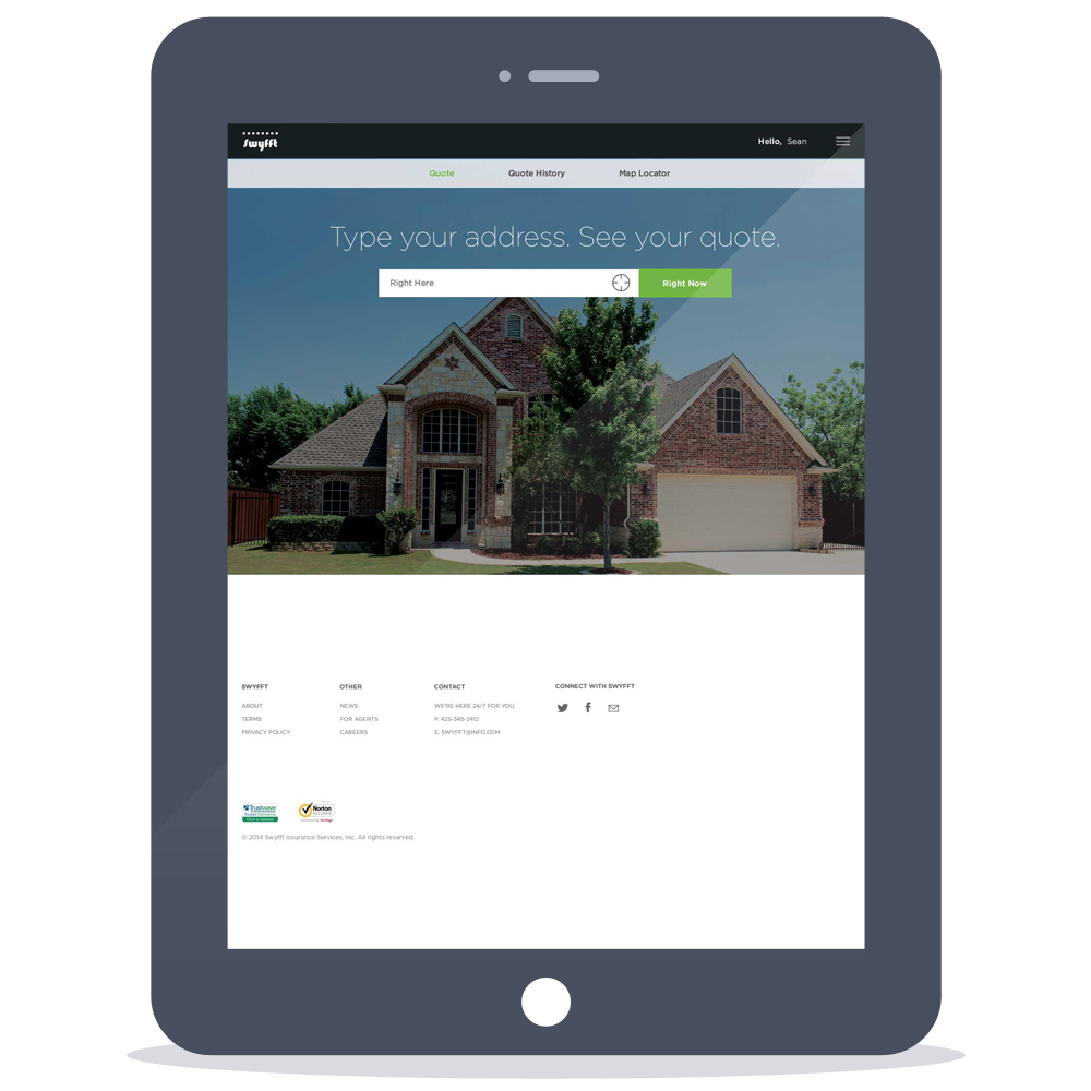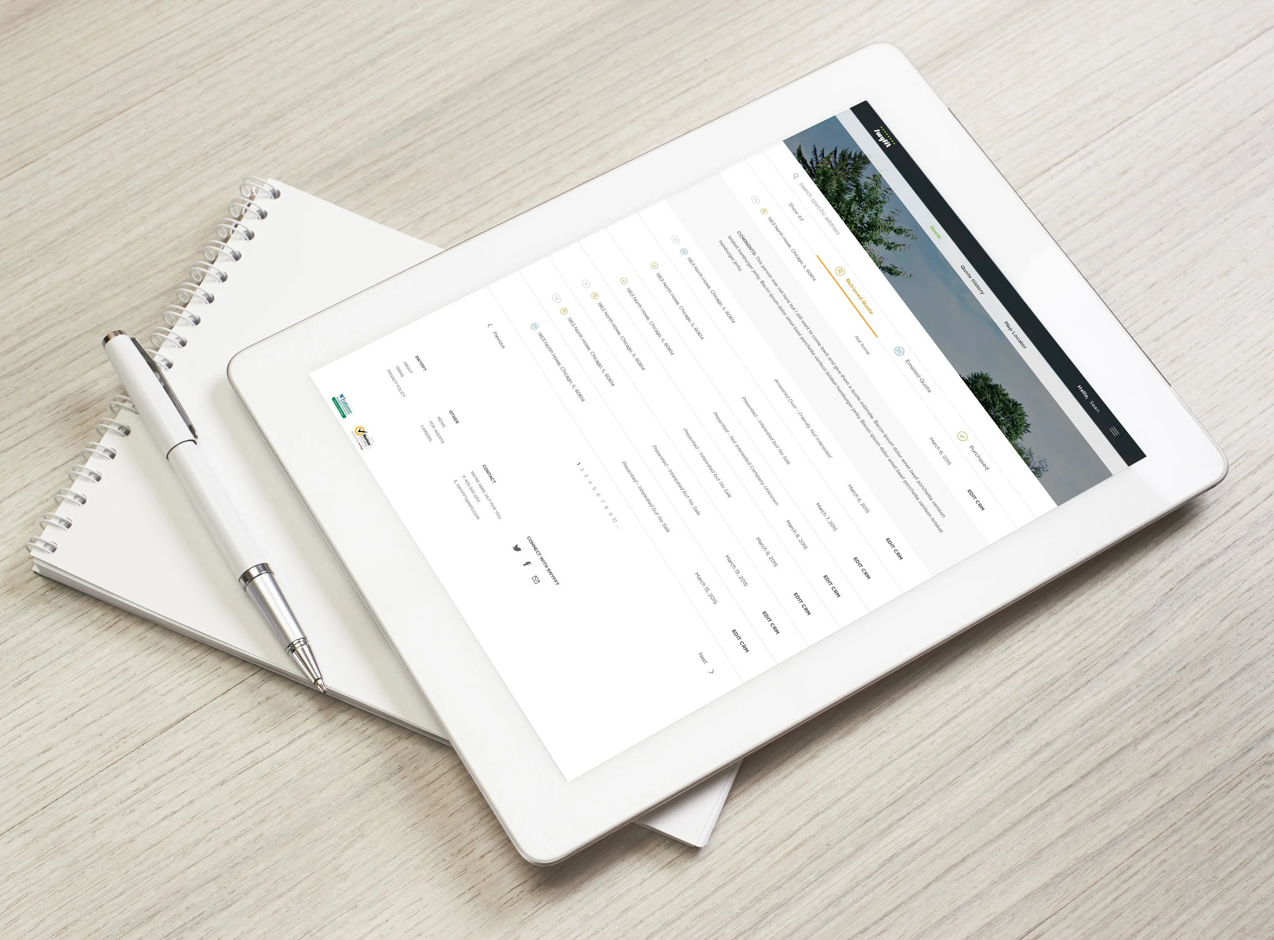
Swyfft: responsive site and agent portal. As the lead designer on this extensive project, I began the process with competitor analysis on current home insurance brands. A significant amount of research was gathered, so I dove into site architecture and wireframing. I then translated them to a fully responsive design - desktop to mobile. Lastly, I created a dynamic agent portal, optimized for a tablet.
The very beginning of the process started with a detailed site architecture. This map lays out V1 and V2 of the overall site and a detailed map of the quote process.


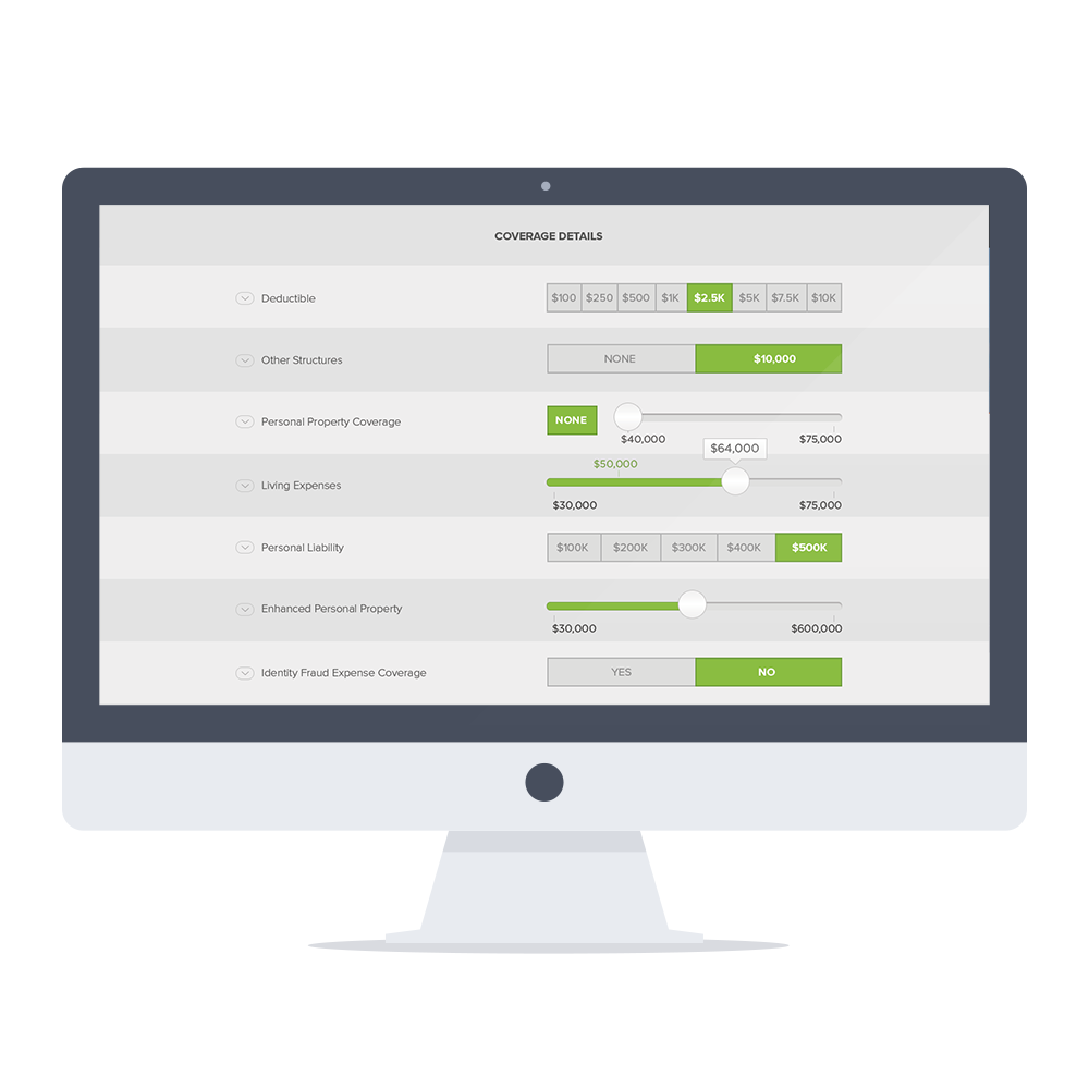
Once all of the pages were accounted for in the site architecture, I began wireframes of the desktop dimensions. Designing with responsive functionality as key.


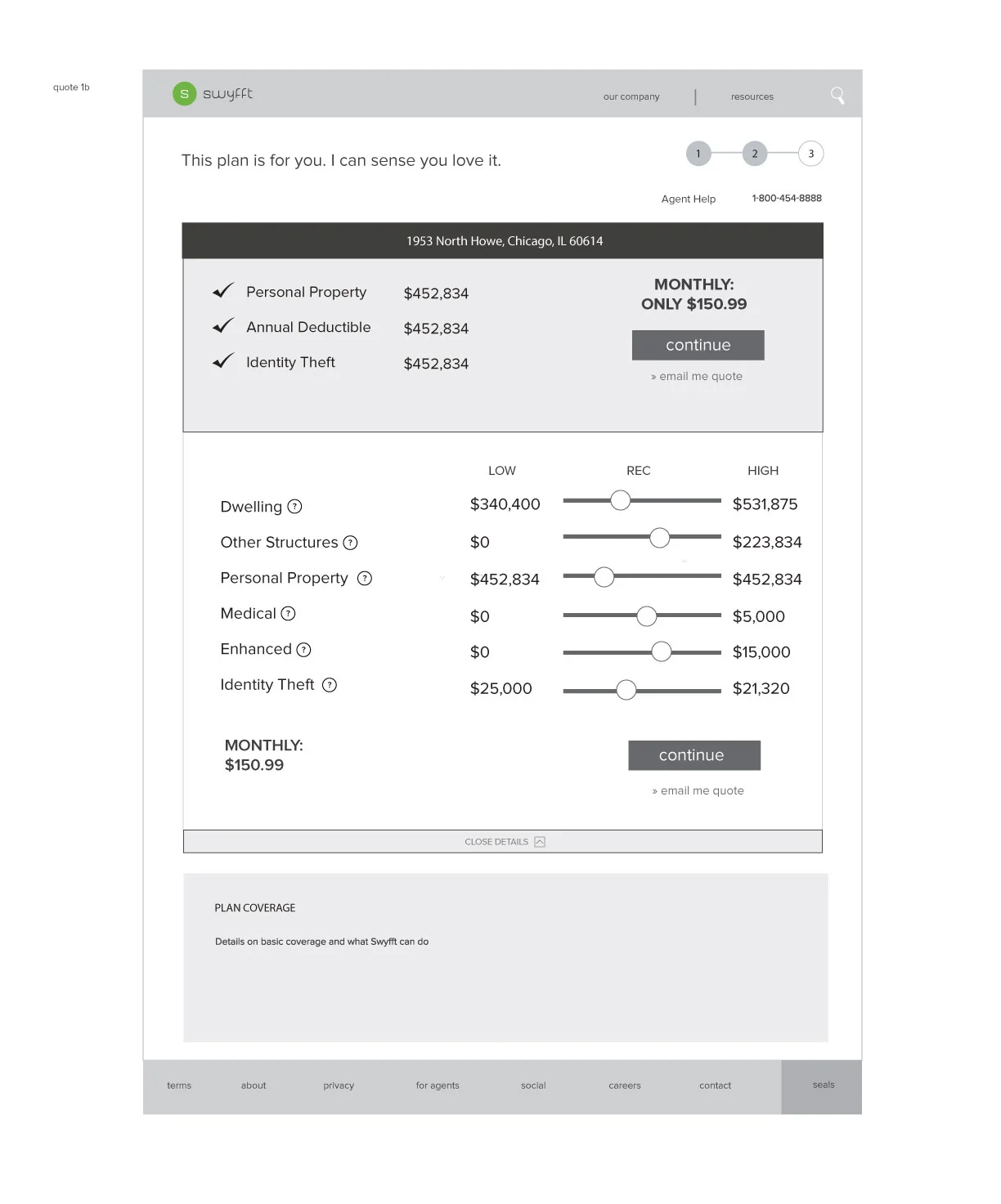

The client selected a wireframe direction, so I began translating the wireframes into full designs. I first created moodboards to help the client pick a direction, and soon incorporated the selected style throughout the UI.